

We helped the up and coming fintech player Stocksholm to consolidate and package their idea.
- Client
- Stocksholm
- Year
- 2018 – 2022
- Assignment
- Art direction
- UX design
- Visual design
- Deliveries
- Visual designs
- Design system
- Prototypes
Background
Stocksholm, a swedish fintech startup, approached us needing help with fitting their very potent stock recommendations algorithm, into a consumer market.
Our ambition was to release the full potential of their very exciting idea, by rethinking its packaging and presentation.
The task included a total rebranding and redesign of their current site as well as solving some pretty unique and complex UX tasks.


Since the product being an algorithm and a system for buying and selling stocks, our main challenge was:
How do we, in a digestible way, explain what the product is?
And secondly, how do we load that message with trust and credibility? After picking our clients brain, understanding the product, identifying target groups, inspiration, goals and ambitions, we set off sketching.
Besides a thorough UX overhaul where branding, navigation, filters for finding stocks, listing and detail pages got reworked, efforts were made to get into the mindset of an uninitiated user. How do we best explain the product without saying too much too fast?
The solution was a welcoming but still informative start page, that took a step by step approach in explaining the product and what the user had to gain from signing up.

UX and strategy – Take 1:
Our first approach was based on the assumption that members wanted to be able to make ethical choices when adding stocks to their portfolio. The idea was sound, but too vague to guarantee promised results and to make users understand.
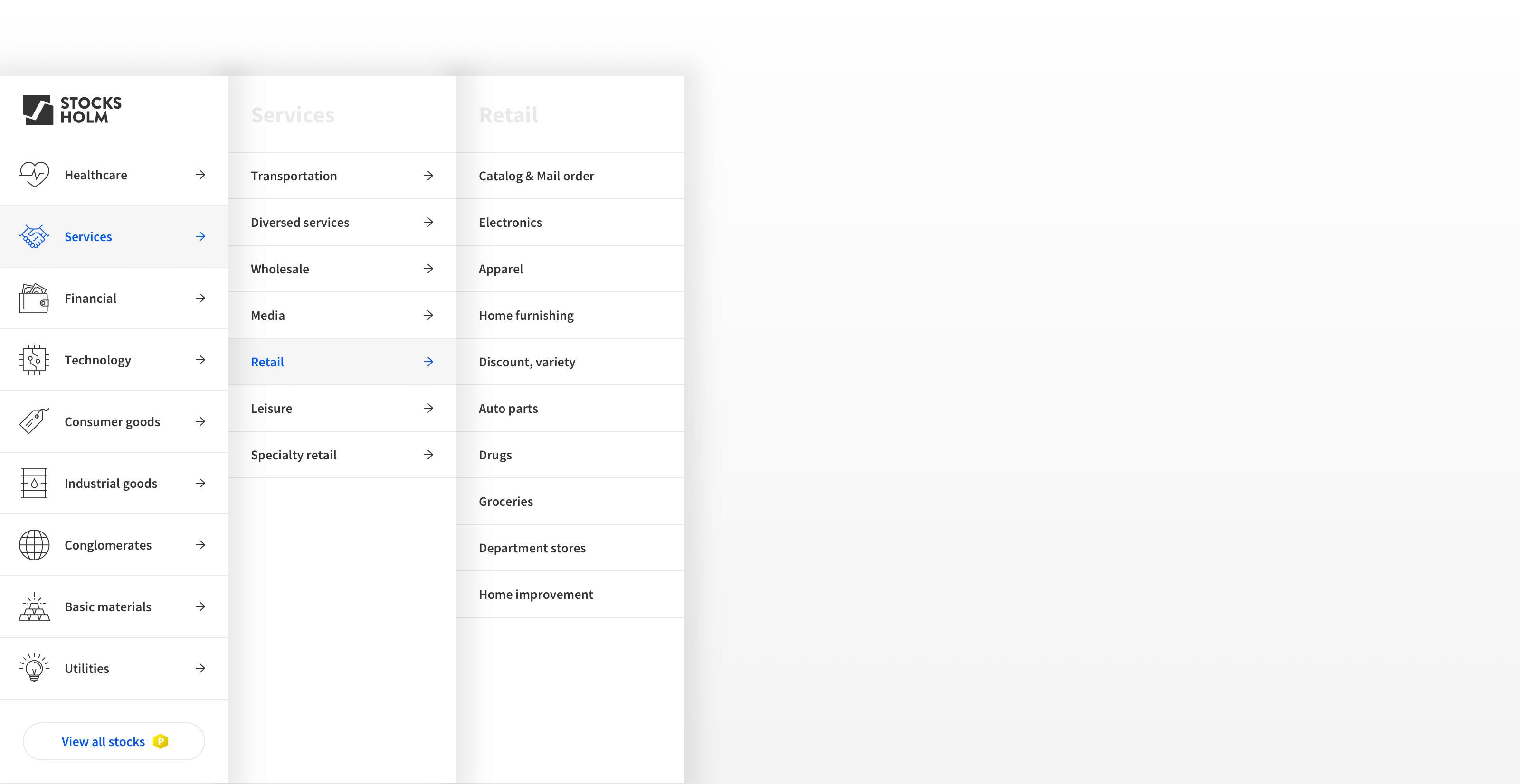
Months later we were tasked with designing the rebalancing process. And now revelation struck.
In a nutshell: Stocksholm members are periodically prompted to sell and buy stocks based on how they perform, thus rebalancing their portfolios.
If we could simplify this process by restricting freedom to browse, minimise options etc, we would refine the product and make it much easier to understand.
We realised that this refined version was the product.
A member should still be able to freely browse stocks, but in order to achieve the guaranteed results, the actual recommendation engine would have to be much more rigid and strict. In our minds the product became a “program”.
Defining it this way made it easier to see what we needed to do: We designed an onboarding to guide the user through the process and we created a simple UI that gave the user only the necessary options for investing and rebalancing.
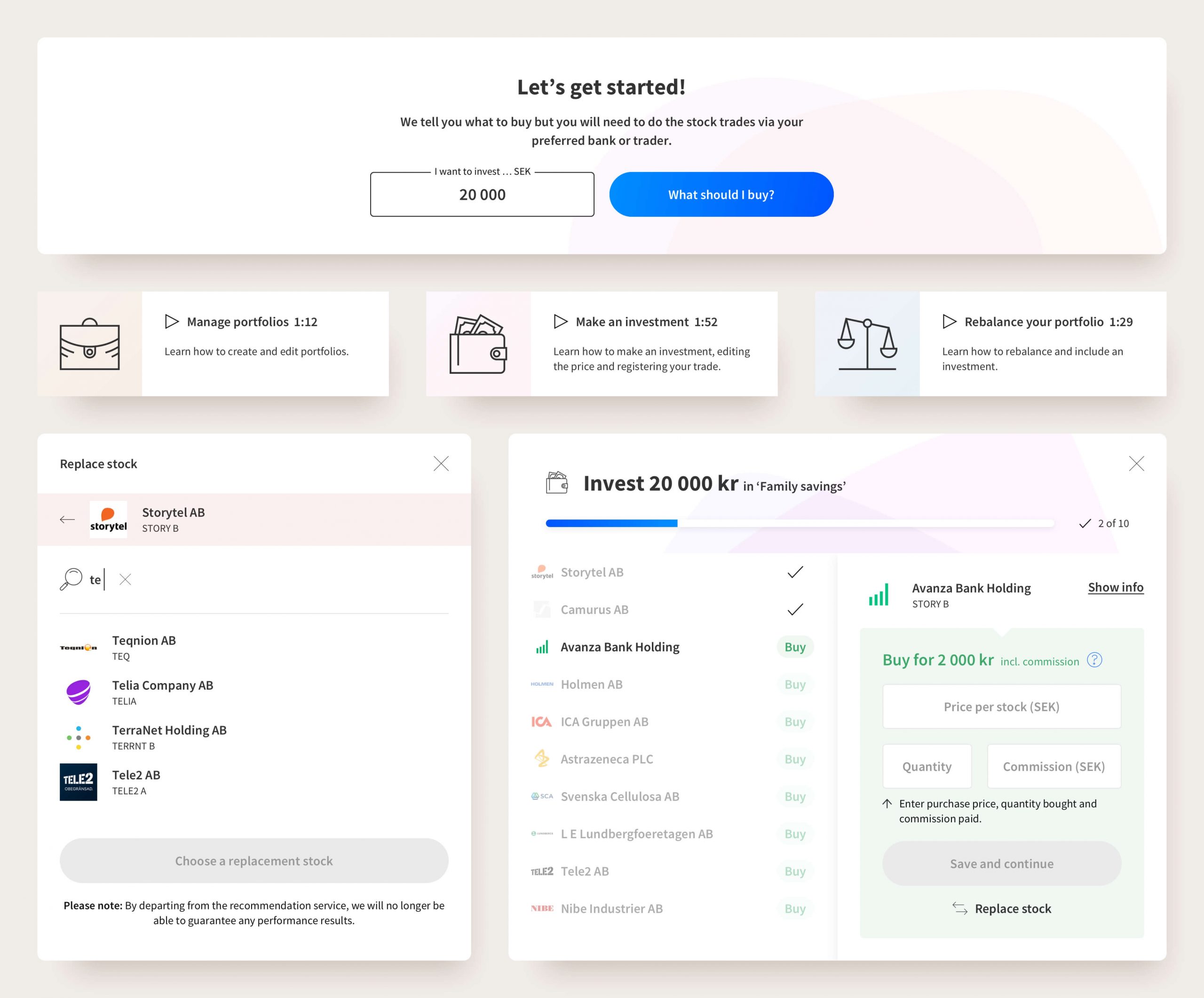
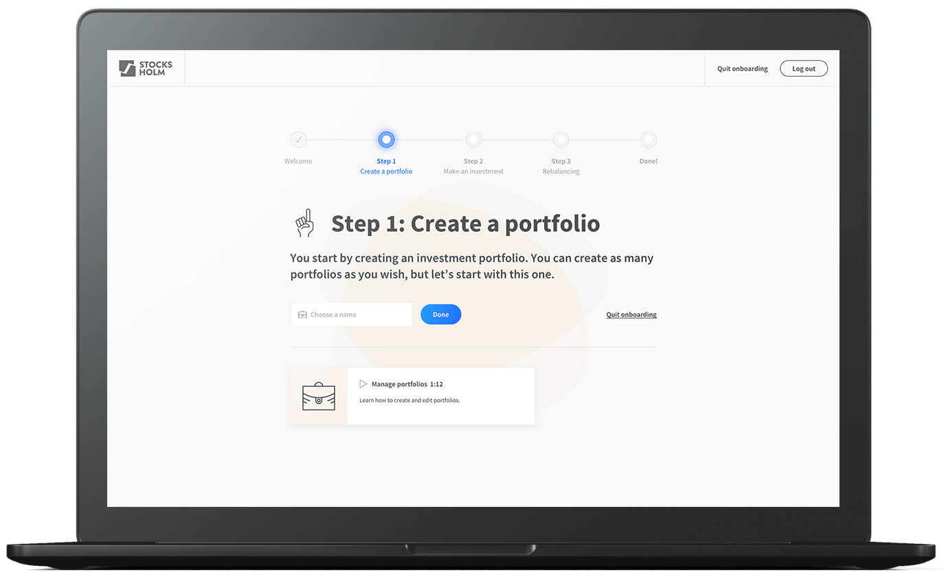
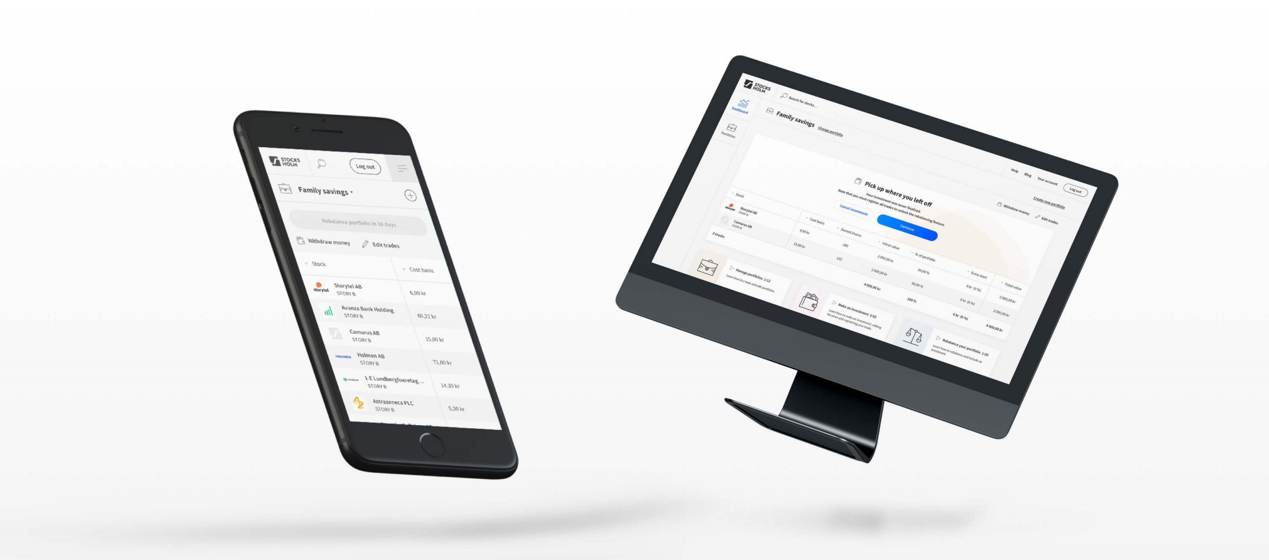
This project was truly being defined as we went along and the client came to the same realisations and conclusions about their own product as we did.
Sure, it may have taken two tries for this project to truly find it’s identity, but that process was necessary.
Stocksholm is now live. If you want to get stock recommendations based on data and performance put in a system that is guaranteed to beat the index, make sure you check Stocksholm out.

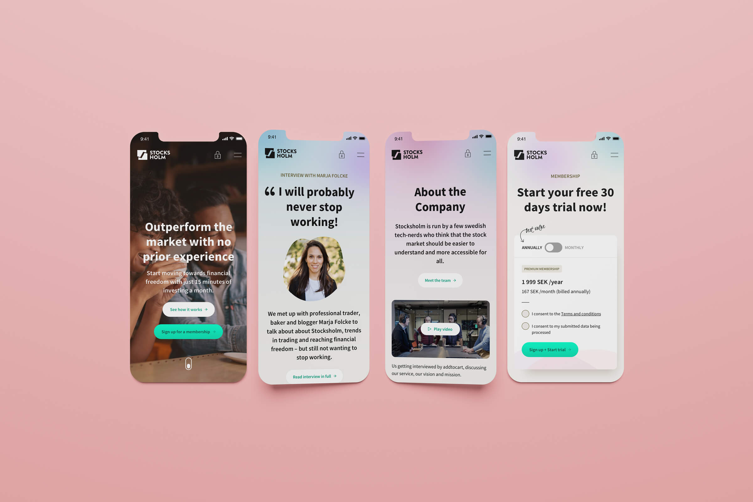
Reworked look and feel:
After having put a lot of work and effort into the UX, we’re currently focusing on the visuals and an updated look and feel for the brand. This is a sneak peek of our work in progress.