
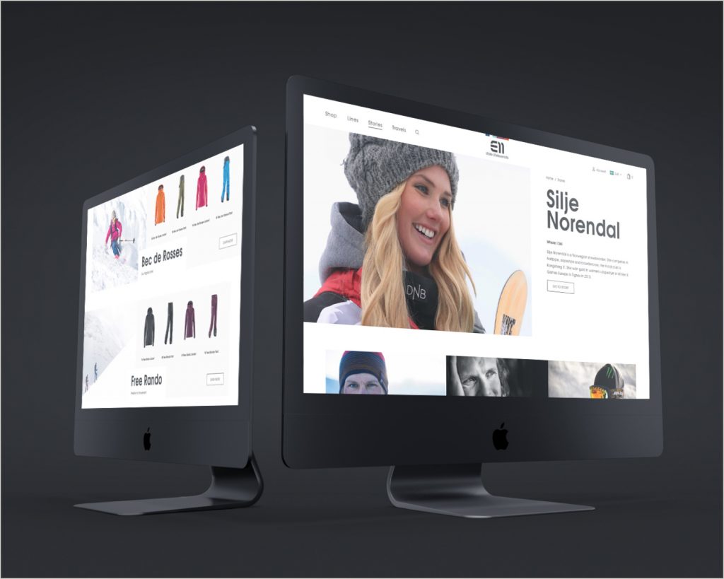
We redesigned Elevenate – a premium outdoor clothing brand with it’s soul in the Swedish mountains.
- Client
- Elevenate
- Year
- 2018
- Assignment
- UX design
- Visual design
- Deliveries
- Responsive visual designs
- Design system
- Prototypes
Background
Elevenate was founded in Åre, Sweden, in 2010, by individuals working in and around the Swedish mountains.
Their ambition is to put all of their combined knowledge and experience into making high quality outdoor apparel suited for a life in those surroundings.
In 2018 we were approached to make a complete redesign of their site.
The challenge
The competition in the outdoor clothing industry is fierce to say the least, so our main challenge instantly became clear: While working on a tight budget – how do we best present Elevenate as the premium brand it is?
Thankfully we learned that some important pieces were in place already from the start.
The preconditions
Elevenate was founded by active creatives with a big network of people who live and work close to nature. They know how to create and sell products for outdoor usage and can accurately visualise and package that experience.
Working with brand ambassadors gives Elevenate a great platform for showcasing their products, but also to fuel the brand with credibility and quality. This by creating a bond between the brand, the skills and lifestyles of the ambassadors, and the beautiful landscapes where they perform their art.
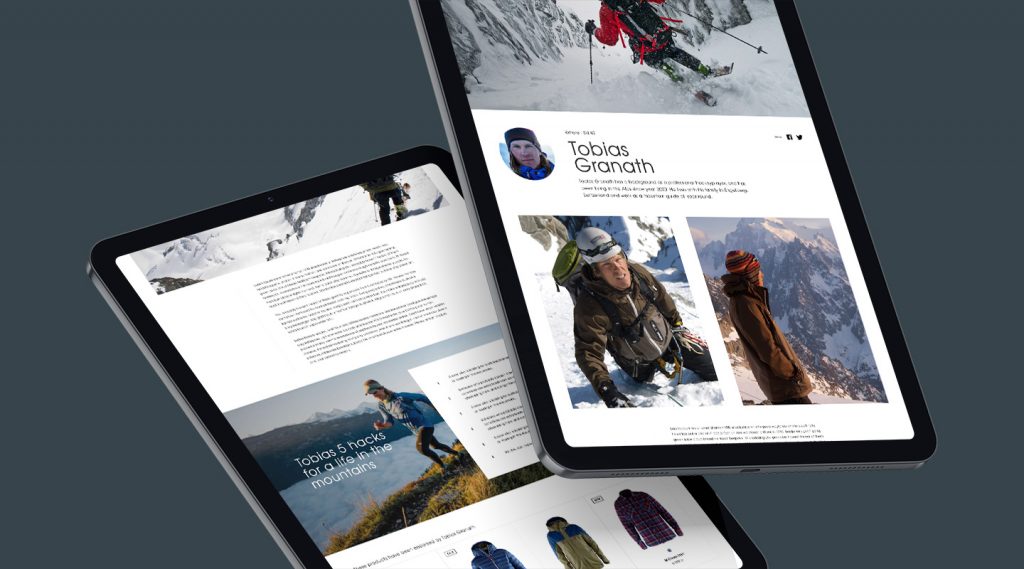
UX and strategy – Ambassadors
To make a fair presentation of all the talented ambassadors endorsing the brand, we designed an extensive space containing interviews, advice, beautiful imagery as well as their favourite Elevenate products.
The process
When working with a brand with strong imagery, we generally try and keep the visuals clean and simple, thus framing the pictures. Since designing for skiing apparel, selecting a snowy white layout made sense.
So one challenge we faced was – how to create personality and uniqueness with a clean, white layout where the imagery should be in focus?
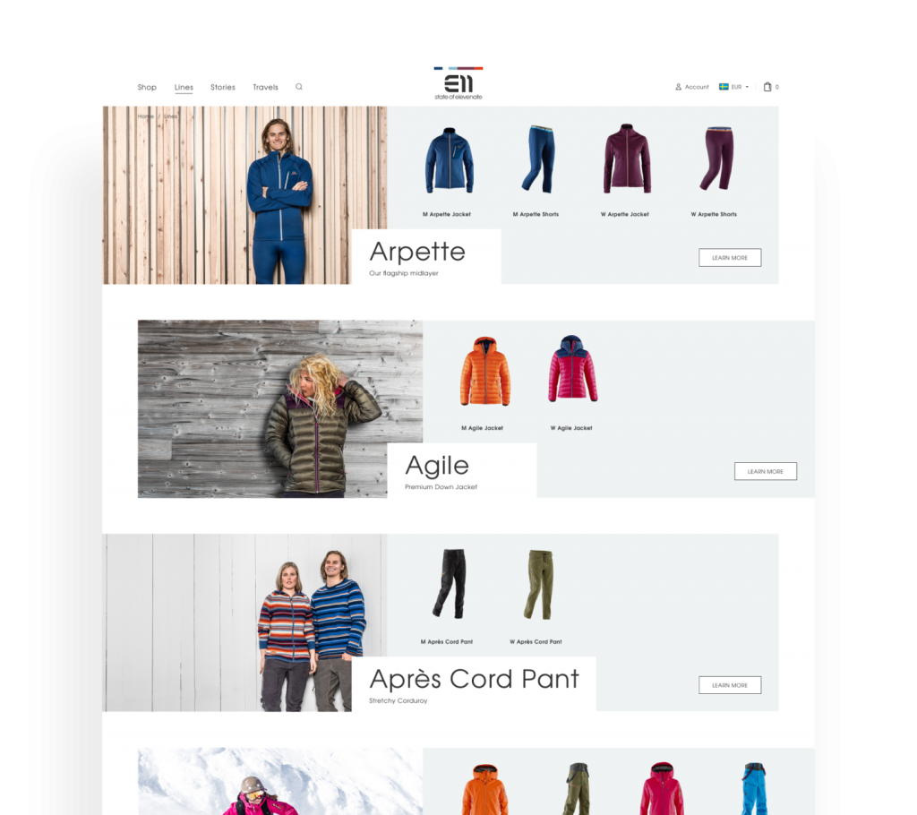
Our approach was to add a slightly asymmetric touch to the layout, whilst being strict with margins, to create almost a pattern out of negative space. This approach was constant throughout the design process and became part of the branding.
UX and strategy
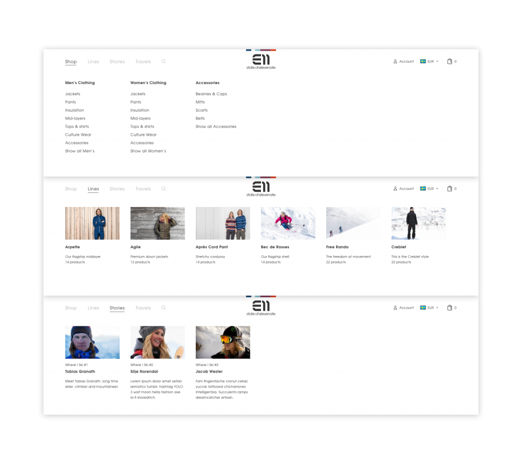
Regarding the UX, our main objective was (as always) to make it easy to find products. We applied best practice approaches to navigation and filters, highlighted available colors on the product listing page, as well as a product description shown on hover.